Location ······· N/A
Published ······ Fall 2020
Theme ········· Daylighting Strategy
Type ·······Reading and leisure spaceenter
Published ······ Fall 2020
Theme ········· Daylighting Strategy
Type ·······Reading and leisure spaceenter

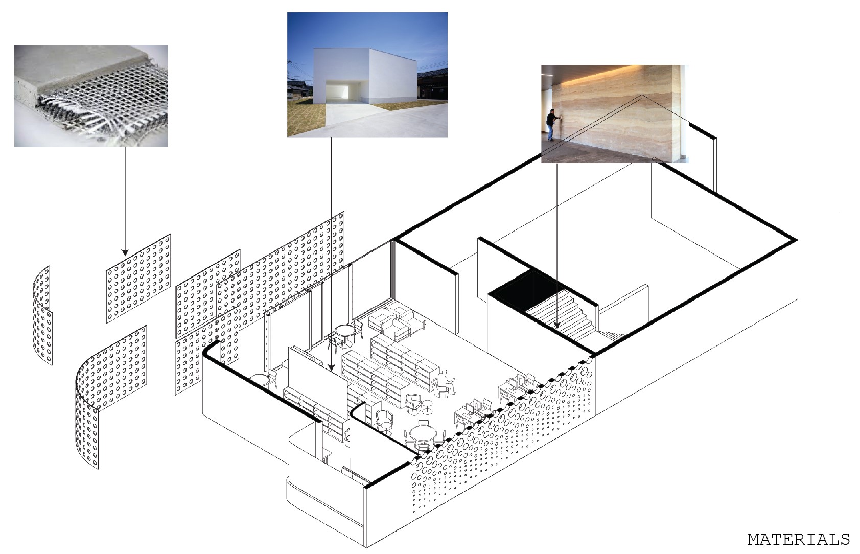
When designing the lighting approach for this gallery and reading room, the two images below were key precedents in creating the desired lighting effect. On the left, the small box of light that contrasts the outside; and on the right, a gentle layering of light from horizon to the forground.

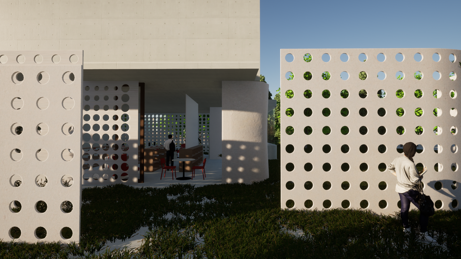
Using soft and earthy materials, the approach in the reading room is to break up the light crossing through the space using perferated walls. The light that is let in is then casted to create a layering effect in the space.
On the west facing wall, the light box idea is brought into the program as a small outcropped lounge area whose entrance is made with only a small gap facing the approach. When entering the room this embodies itself by becoming just a narrow column of light that faces the entrance, a small clue to the well lit space beyond.
On the west facing wall, the light box idea is brought into the program as a small outcropped lounge area whose entrance is made with only a small gap facing the approach. When entering the room this embodies itself by becoming just a narrow column of light that faces the entrance, a small clue to the well lit space beyond.


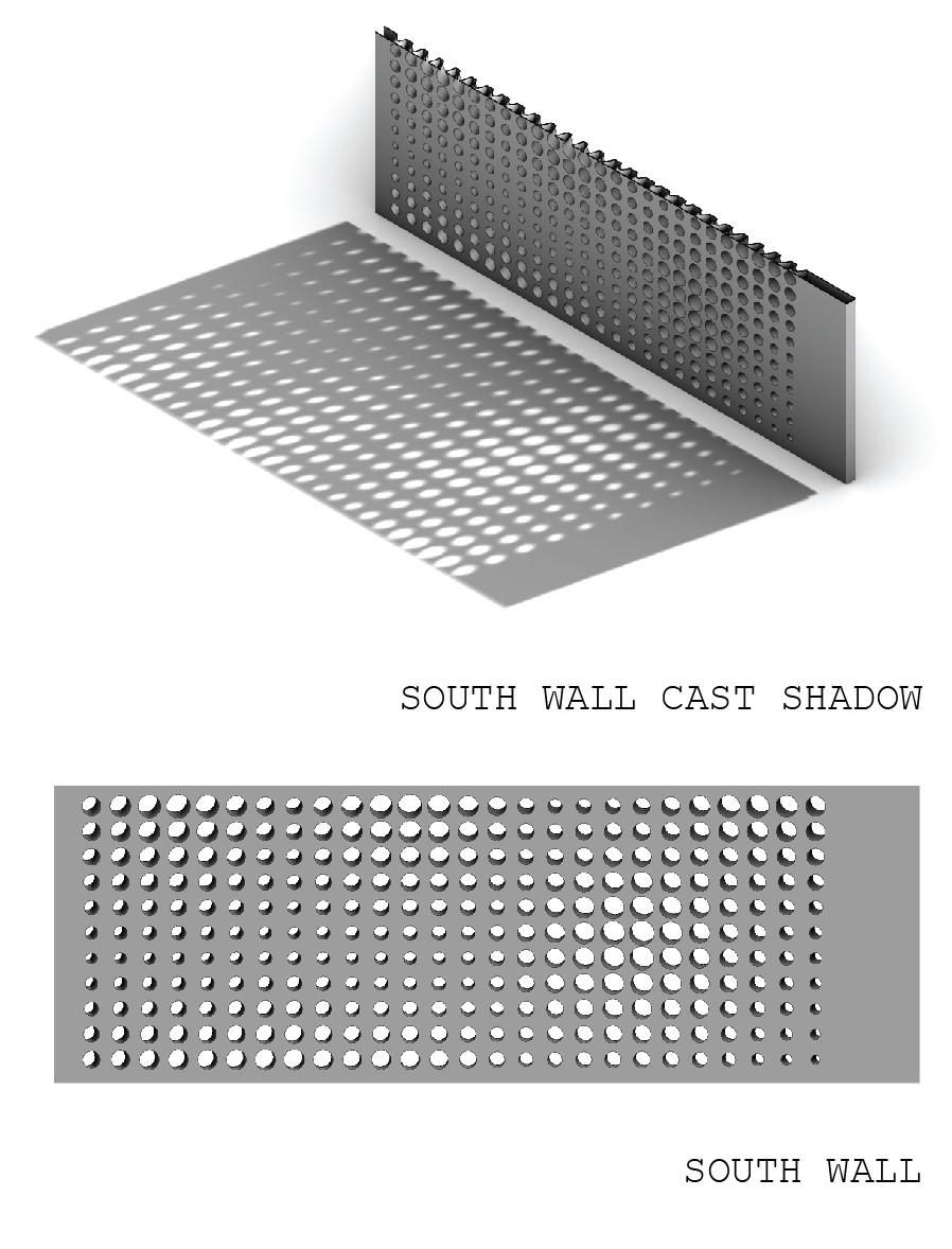
There are perferations in the wall on the south facing side of the room over the computer desks and tables for reading. This wall is treated with a custom pattern proven in light tests to manage accute control over the lighting for those sitting closest to the wall. The hole’s sizes and locations are optomized by running the seating and task locations, along with their lighting requirments through a short grasshopper script. Each hole is then given an angled approach to block the direct light at eye level.
![]()


